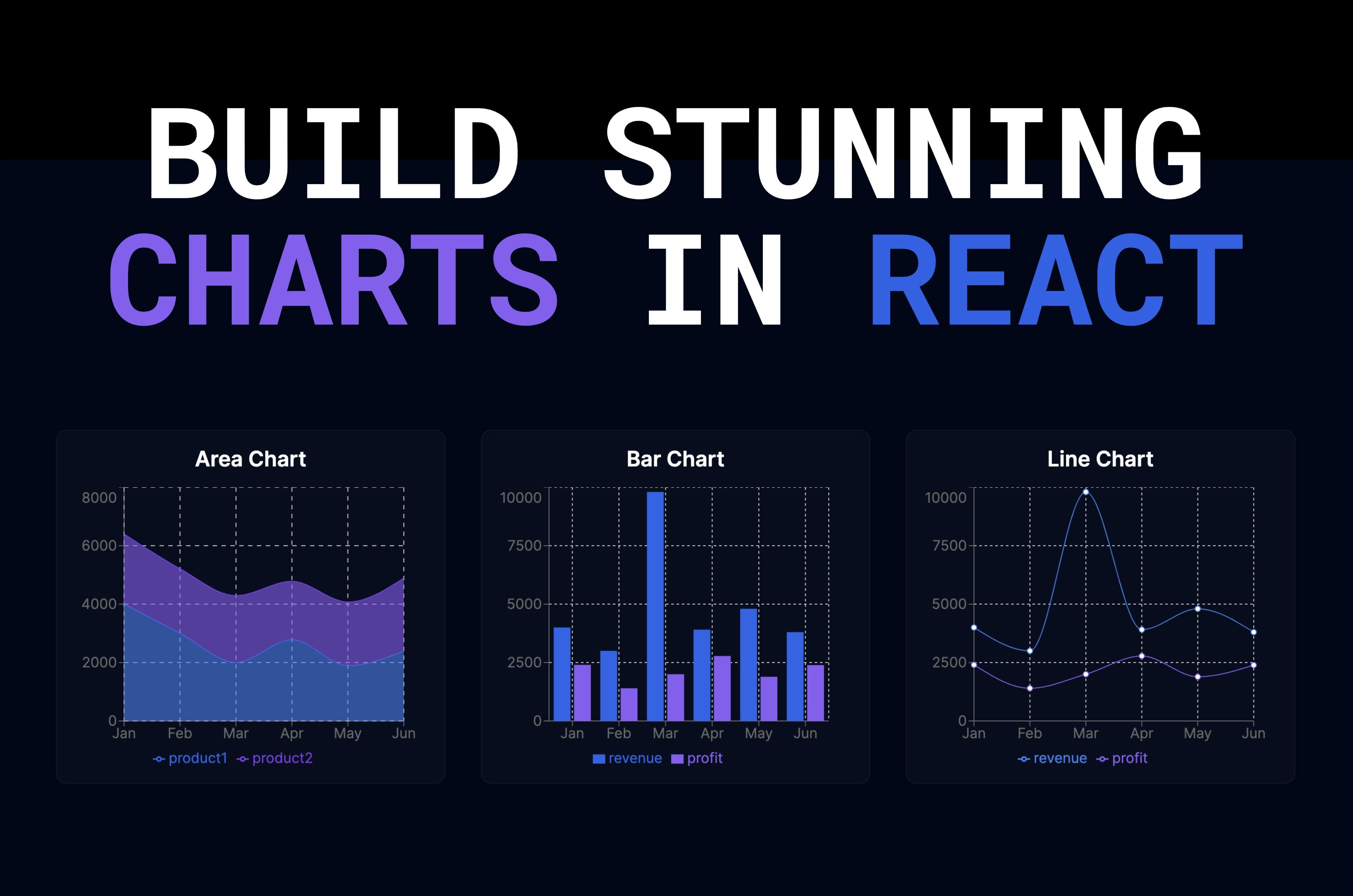
Today we're going to learn how to create beautiful charts in React with Recharts.
We'll build an area chart, a bar chart, and a line chart that have a nice little animation when they're rendered. The charts are responsive and we can hover over them and see the data in the tooltip.
Everything is customizable, not just the colors. For example, if you don't want the Cartesian grid or the Y axis, you can just remove them.
To build charts, you just import the modules you need, because Recharts is built specifically for React.
Recharts has more charts like pie charts, radar charts, scatter charts, and so on.
You'll find a full list on their documentation. Once you understand how to create a chart, you can create any chart you want. So let's get started!
👨🏻💻 Here's What You'll Learn
- What is Recharts
- How to install Recharts
- How to create an area chart, bar chart, and line chart
- How to make your charts responsive
- How to customize your charts
- How to add a tooltip to your charts and customize it
- How to add a legend to your charts
- How to add a grid to your charts
- How to add an x-axis and y-axis to your charts
📺 Video Tutorial
If you prefer to watch a video tutorial instead, here you go! 👇
If not, you can skip this section and continue reading the article below.
Setup
Let's start with an empty Next.js app that uses the app router, the src directory, and Tailwind CSS for styling.
I deleted any existing styles in the global CSS file. Inside layout.js, I added a simple dark background to the html element.
@tailwind base;
@tailwind components;
@tailwind utilities;import { Inter } from 'next/font/google';
import './globals.css';
const inter = Inter({ subsets: ['latin'] });
export const metadata = {
title: 'Recharts Next.js',
description: 'An example of using Recharts with Next.js',
};
export default function RootLayout({ children }) {
return (
<html lang="en" className="bg-slate-950 text-white">
<body className={inter.className}>{children}</body>
</html>
);
}Inside the page.js file, I added a simple grid with three grid items that will hold the charts.
export default function Home() {
  return (
    <main className="flex min-h-screen flex-col items-center justify-center px-4 md:px-8 xl:px-10 py-44">
      <div className="grid xl:grid-cols-3 lg:grid-cols-2 w-full gap-10 max-w-[1400px]">
        <GridItem title="Area Chart"></GridItem>

        <GridItem title="Bar Chart"></GridItem>

        <GridItem title="Line Chart"></GridItem>
      </div>
    </main>
  );
}

function GridItem({ title, children }) {
  return (
    <div className="flex flex-col items-center justify-center p-4 border border-slate-900 bg-slate-900/50 rounded-xl h-[400px]">
      <h3 className="text-2xl font-semibold text-white mb-4">{title}</h3>
      {children}
    </div>
  );
}
Here's what it looks like before adding the charts. Now, it's time that we create the charts.
Installation
To get started with Recharts, we need to install it run npm install recharts in your terminal.
After it's installed, let's create our first chart.
Area Chart
Let's start with an area chart. Create a new folder inside the app directory called components.
Inside that folder, create a new file called AreaChart.jsx.
For now, let's just return a simple h1 tag with the text Area Chart.
'use client';

const AreaChartComponent = () => {
  return <h1>Area Chart</h1>;
};

export default AreaChartComponent;
We need 'use client' at the top because we will add interactivity to the chart later. Now, let's import it inside the page.js file and render it inside the first grid item.
import AreaChart from './components/AreaChart';

export default function Home() {
  return (
    <main className="flex min-h-screen flex-col items-center justify-center px-4 md:px-8 xl:px-10 py-44">
      <div className="grid xl:grid-cols-3 lg:grid-cols-2 w-full gap-10 max-w-[1400px]">
        <GridItem title="Area Chart">
          <AreaChart />
        </GridItem>

        <GridItem title="Bar Chart"></GridItem>

        <GridItem title="Line Chart"></GridItem>
      </div>
    </main>
  );
}

function GridItem({ title, children }) {
  return (
    <div className="flex flex-col items-center justify-center p-4 border border-slate-900 bg-slate-900/50 rounded-xl h-[400px]">
      <h3 className="text-2xl font-semibold text-white mb-4">{title}</h3>
      {children}
    </div>
  );
}
Okay, let's create our first chart for real. The great thing about recharts is that it's built for React, so we can simply import the modules we need.
This also means we can customize it however we want, and decide if we need a X or Y axis, a grid or a legend, and so on.
We're gonna start with a simple area chart with only one area and then build it up from there.
First, we import the components we need from recharts. Import AreaChart and Area.
'use client';

import { AreaChart, Area } from 'recharts';

const AreaChartComponent = () => {
  return <h1>Area Chart</h1>;
};

export default AreaChartComponent;
Before we can render the chart, we need to provide some data. Let's create a simple array of product sales.
'use client';

import { AreaChart, Area } from 'recharts';

const productSales = [
  {
    name: 'Jan',
    product1: 4000,
    product2: 2400,
  },
  {
    name: 'Feb',
    product1: 3000,
    product2: 2210,
  },
  {
    name: 'Mar',
    product1: 2000,
    product2: 2290,
  },
  {
    name: 'Apr',
    product1: 2780,
    product2: 2000,
  },
  {
    name: 'May',
    product1: 1890,
    product2: 2181,
  },
  {
    name: 'Jun',
    product1: 2390,
    product2: 2500,
  },
];

const AreaChartComponent = () => {
  return <h1>Area Chart</h1>;
};

export default AreaChartComponent;
Now, we can render the chart. Let's add the AreaChart component and pass the data as a prop.
Inside the AreaChart component, we can add the Area component and pass the data key as a prop.
The data key is the name of the property in the data array, so make sure it matches.
const AreaChartComponent = () => {
  return (
    <AreaChart width={500} height={400} data={productSales}>
      <Area dataKey="product1" />
    </AreaChart>
  );
};
And that's it. We have a simple area chart. You might notice that the chart is too big for the grid item.
We can fix this by wrapping the chart inside a responsive container. You can do this with every chart.
import { AreaChart, Area, ResponsiveContainer } from 'recharts';

const AreaChartComponent = () => {
  return (
    <ResponsiveContainer width="100%" height="100%">
      <AreaChart width={500} height={400} data={productSales}>
        <Area dataKey="product1" />
      </AreaChart>
    </ResponsiveContainer>
  );
};
Import the ResponsiveContainer component from recharts and wrap the AreaChart component inside it.
Add the width and height props to the ResponsiveContainer component and set them to 100%.
Now the chart is responsive and fits the grid item.
We can add more props to Area to customize the chart. For example, we can smooth the chart by adding the type prop and setting it to monotone.
<Area type="monotone" dataKey="product1" />To change the colors, we can add the stroke and fill props to Area.
<Area type="monotone" dataKey="product1" stroke="#2563eb" fill="#3b82f6" />This is how the chart looks like now.
Let's add a second area to the chart. We can do this by adding another Area component and passing the data key as a prop. This time we use it for product 2.
<Area type="monotone" dataKey="product1" stroke="#2563eb" fill="#3b82f6" />

<Area type="monotone" dataKey="product2" stroke="#7c3aed" fill="#8b5cf6"/>
With that, we have two charts that overlap each other. Each chart represents a product.
However, the one I showed you in the beginning were stacked. We can simply achieve this by adding the stackId prop to both Area components and setting it to 1.
<Area type="monotone" dataKey="product1" stroke="#2563eb" fill="#3b82f6" stackId="1" />

<Area type="monotone" dataKey="product2" stroke="#7c3aed" fill="#8b5cf6" stackId="1" />
It looks better now, but it's still very simple and its missing a grid, the X and Y axis, a legend, and a tooltip. Let's add the grid and the axis first.
With Recharts, we simply import these components and add them to the chart. Let's import the XAxis, YAxis, as well as a CartesianGrid.
import {
  AreaChart,
  Area,
  ResponsiveContainer,
  XAxis,
  YAxis,
  CartesianGrid,
} from 'recharts';

const AreaChartComponent = () => {
  return (
    <ResponsiveContainer width="100%" height="100%">
      <AreaChart width={500} height={400} data={productSales}>
        <YAxis />
        <XAxis dataKey="name" />
        <CartesianGrid />

        <Area
          type="monotone"
          dataKey="product1"
          stroke="#2563eb"
          fill="#3b82f6"
          stackId="1"
        />
        <Area
          type="monotone"
          dataKey="product2"
          stroke="#7c3aed"
          fill="#8b5cf6"
          stackId="1"
        />
      </AreaChart>
    </ResponsiveContainer>
  );
};
It looks better now, but I want the grid to be dashed. We can do this by adding the strokeDasharray prop to the CartesianGrid component and setting it to 5 5.
<CartesianGrid strokeDasharray="5 5" />With that the grid is dashed.
Finally, let's add the legend and a tooltip. We can do this by importing the Legend and Tooltip components.
import {
  AreaChart,
  Area,
  ResponsiveContainer,
  XAxis,
  YAxis,
  CartesianGrid,
  Tooltip,
  Legend,
} from 'recharts';

const AreaChartComponent = () => {
  return (
    <ResponsiveContainer width="100%" height="100%">
      <AreaChart width={500} height={400} data={productSales}>
        <YAxis />
        <XAxis dataKey="name" />
        <CartesianGrid strokeDasharray="5 5" />

        <Tooltip />
        <Legend />

        <Area
          type="monotone"
          dataKey="product1"
          stroke="#2563eb"
          fill="#3b82f6"
          stackId="1"
        />
        <Area
          type="monotone"
          dataKey="product2"
          stroke="#7c3aed"
          fill="#8b5cf6"
          stackId="1"
        />
      </AreaChart>
    </ResponsiveContainer>
  );
};
Now the chart has a proper legend and if we hover over the data points, we can see a tooltip with the data.
However, since we set a dark background and the text to white, we can't see the text in the tooltip. We can fix this by adding a custom tooltip.
It's very easy to create a custom tooltip.
Create a new component below the AreaChart component and call it CustomTooltip.
const CustomTooltip = ({ active, payload, label }) => {
  if (active && payload && payload.length) {
    return (
      <div className="p-4 bg-slate-900 flex flex-col gap-4 rounded-md">
        <p className="text-medium text-lg">{label}</p>
        <p className="text-sm text-blue-400">
          Product 1:
          <span className="ml-2">${payload[0].value}</span>
        </p>
        <p className="text-sm text-indigo-400">
          Product 2:
          <span className="ml-2">${payload[1].value}</span>
        </p>
      </div>
    );
  }
};
We can take three props: active, payload, and label. active is a boolean that indicates if the tooltip is active or not.
payload is an array of objects that contains the data for the
tooltip. label is the label of the data point.
To use the custom tooltip, we need to pass it to the Tooltip component as a prop. We set the content prop to our custom tooltip.
<Tooltip content={<CustomTooltip />} />And that's it. If we hover over the chart now, we can see our custom tooltip. The colors are correct and we can see the data for both products and the label.
Finally, let's add some margins to the chart, so the right side looks similar to the left side.
We can pass a margin prop to the AreaChart component and set it to an object with the right property set to 30.
<AreaChart width={500} height={400} data={productSales} margin={{ right: 30 }}>With that our area chart is done. The workflow I showed you is the same for every chart. You can customize it however you want and add as many components as you need.
If you need to find out more about the components and props, you can check out the documentation on the Recharts website.
They have a nice page with a list of different examples and styling options.
Bar Chart
Let's quickly add the rest of the charts, starting with the bar chart. Create a new file inside the components directory and call it BarChart.jsx.
'use client';

import {
  BarChart,
  Bar,
  XAxis,
  YAxis,
  CartesianGrid,
  Tooltip,
  Legend,
  ResponsiveContainer,
} from 'recharts';

const salesData = [
  {
    name: 'Jan',
    revenue: 4000,
    profit: 2400,
  },
  {
    name: 'Feb',
    revenue: 3000,
    profit: 1398,
  },
  {
    name: 'Mar',
    revenue: 9800,
    profit: 2000,
  },
  {
    name: 'Apr',
    revenue: 3908,
    profit: 2780,
  },
  {
    name: 'May',
    revenue: 4800,
    profit: 1890,
  },
  {
    name: 'Jun',
    revenue: 3800,
    profit: 2390,
  },
];

const BarChartComponent = () => {
  return (
    <ResponsiveContainer width="100%" height="100%">
      <BarChart
        width={500}
        height={300}
        data={salesData}
        margin={{
          right: 30,
        }}
      >
        <CartesianGrid strokeDasharray="3 3" />
        <XAxis dataKey="name" />
        <YAxis />
        <Tooltip content={<CustomTooltip />} />
        <Legend />
        <Bar dataKey="revenue" fill="#2563eb" />
        <Bar dataKey="profit" fill="#8b5cf6" />
      </BarChart>
    </ResponsiveContainer>
  );
};

export default BarChartComponent;

const CustomTooltip = ({ active, payload, label }) => {
  if (active && payload && payload.length) {
    return (
      <div className="p-4 bg-slate-900 flex flex-col gap-4 rounded-md">
        <p className="text-medium text-lg">{label}</p>
        <p className="text-sm text-blue-400">
          Revenue:
          <span className="ml-2">${payload[0].value}</span>
        </p>
        <p className="text-sm text-indigo-400">
          Profit:
          <span className="ml-2">${payload[1].value}</span>
        </p>
      </div>
    );
  }
};
The code is very similar to the area chart. So you can just copy and paste it from the area chart.
The only difference is that we have a salesData array with the data and imported BarChart and Bar from Recharts, instead of AreaChart and Area.
Replace the AreaChart component with BarChart component and Area with Bar.
For our custom tooltip, I replaced Product 1 and Product 2 with Revenue and Profit to match our data.
If we import the BarChart component inside the page.js file and render it inside the second grid item, we can see the bar chart.
import AreaChart from './components/AreaChart';
import BarChart from './components/BarChart';

export default function Home() {
  return (
    <main className="flex min-h-screen flex-col items-center justify-center px-4 md:px-8 xl:px-10 py-44">
      <div className="grid xl:grid-cols-3 lg:grid-cols-2 w-full gap-10 max-w-[1400px]">
        <GridItem title="Area Chart">
          <AreaChart />
        </GridItem>

        <GridItem title="Bar Chart">
          <BarChart />
        </GridItem>

        <GridItem title="Line Chart"></GridItem>
      </div>
    </main>
  );
}

function GridItem({ title, children }) {
  return (
    <div className="flex flex-col items-center justify-center p-4 border border-slate-900 bg-slate-900/50 rounded-xl h-[400px]">
      <h3 className="text-2xl font-semibold text-white mb-4">{title}</h3>
      {children}
    </div>
  );
}
And here's how it looks like. We have a simple bar chart with two bars. The colors are correct and the tooltip shows the correct data.
Once you understand how to create one chart, you can create any chart you want. Let's add the last chart.
Line Chart
Create a new file inside the components directory and call it LineChart.jsx.
'use client';

import {
  LineChart,
  Line,
  XAxis,
  YAxis,
  CartesianGrid,
  Tooltip,
  Legend,
  ResponsiveContainer,
} from 'recharts';

const salesData = [
  {
    name: 'Jan',
    revenue: 4000,
    profit: 2400,
  },
  {
    name: 'Feb',
    revenue: 3000,
    profit: 1398,
  },
  {
    name: 'Mar',
    revenue: 9800,
    profit: 2000,
  },
  {
    name: 'Apr',
    revenue: 3908,
    profit: 2780,
  },
  {
    name: 'May',
    revenue: 4800,
    profit: 1890,
  },
  {
    name: 'Jun',
    revenue: 3800,
    profit: 2390,
  },
];

const LineChartComponent = () => {
  return (
    <ResponsiveContainer width="100%" height="100%">
      <LineChart
        width={500}
        height={300}
        data={salesData}
        margin={{
          right: 30,
        }}
      >
        <CartesianGrid strokeDasharray="3 3" />
        <XAxis dataKey="name" />
        <YAxis />
        <Tooltip content={<CustomTooltip />} />
        <Legend />
        <Line type="monotone" dataKey="revenue" stroke="#3b82f6" />
        <Line type="monotone" dataKey="profit" stroke="#8b5cf6" />
      </LineChart>
    </ResponsiveContainer>
  );
};

export default LineChartComponent;

const CustomTooltip = ({ active, payload, label }) => {
  if (active && payload && payload.length) {
    return (
      <div className="p-4 bg-slate-900 flex flex-col gap-4 rounded-md">
        <p className="text-medium text-lg">{label}</p>
        <p className="text-sm text-blue-400">
          Revenue:
          <span className="ml-2">${payload[0].value}</span>
        </p>
        <p className="text-sm text-indigo-400">
          Profit:
          <span className="ml-2">${payload[1].value}</span>
        </p>
      </div>
    );
  }
};
In this case, I used the same data as for the bar chart. I imported LineChart and Line and added two Line components to the chart.
I also changed the colors to match the theme.
Import the LineChart component inside the page.js file and render it inside the third grid item.
import AreaChart from './components/AreaChart';
import BarChart from './components/BarChart';
import LineChart from './components/LineChart';

export default function Home() {
  return (
    <main className="flex min-h-screen flex-col items-center justify-center px-4 md:px-8 xl:px-10 py-44">
      <div className="grid xl:grid-cols-3 lg:grid-cols-2 w-full gap-10 max-w-[1400px]">
        <GridItem title="Area Chart">
          <AreaChart />
        </GridItem>

        <GridItem title="Bar Chart">
          <BarChart />
        </GridItem>

        <GridItem title="Line Chart">
          <LineChart />
        </GridItem>
      </div>
    </main>
  );
}

function GridItem({ title, children }) {
  return (
    <div className="flex flex-col items-center justify-center p-4 border border-slate-900 bg-slate-900/50 rounded-xl h-[400px]">
      <h3 className="text-2xl font-semibold text-white mb-4">{title}</h3>
      {children}
    </div>
  );
}
And here's how the final product looks like. We have three charts that look great and fit our dark theme.
The charts are responsive and interactive. We can hover over them and see the data. Also it comes with a neat animation when the chart is rendered.
Conclusion
With Recharts, we can create beautiful charts in React. It's easy to use and customize and comes with a lot of features.
The worflow is similar for every chart, so once you understand how to create one chart, you can create any chart you want.
Refer to the documentation if you need to find more about the charts, the props and the modules. That's it from me, see you next time.