In this post, we'll learn how to toggle between light and dark mode in React and Sass. We will start with a single simple button on the main page and use Sass to style it.
Later, however, we will create a more scalable solution using React Context to manage the state of the theme so that all components in the app can access it.
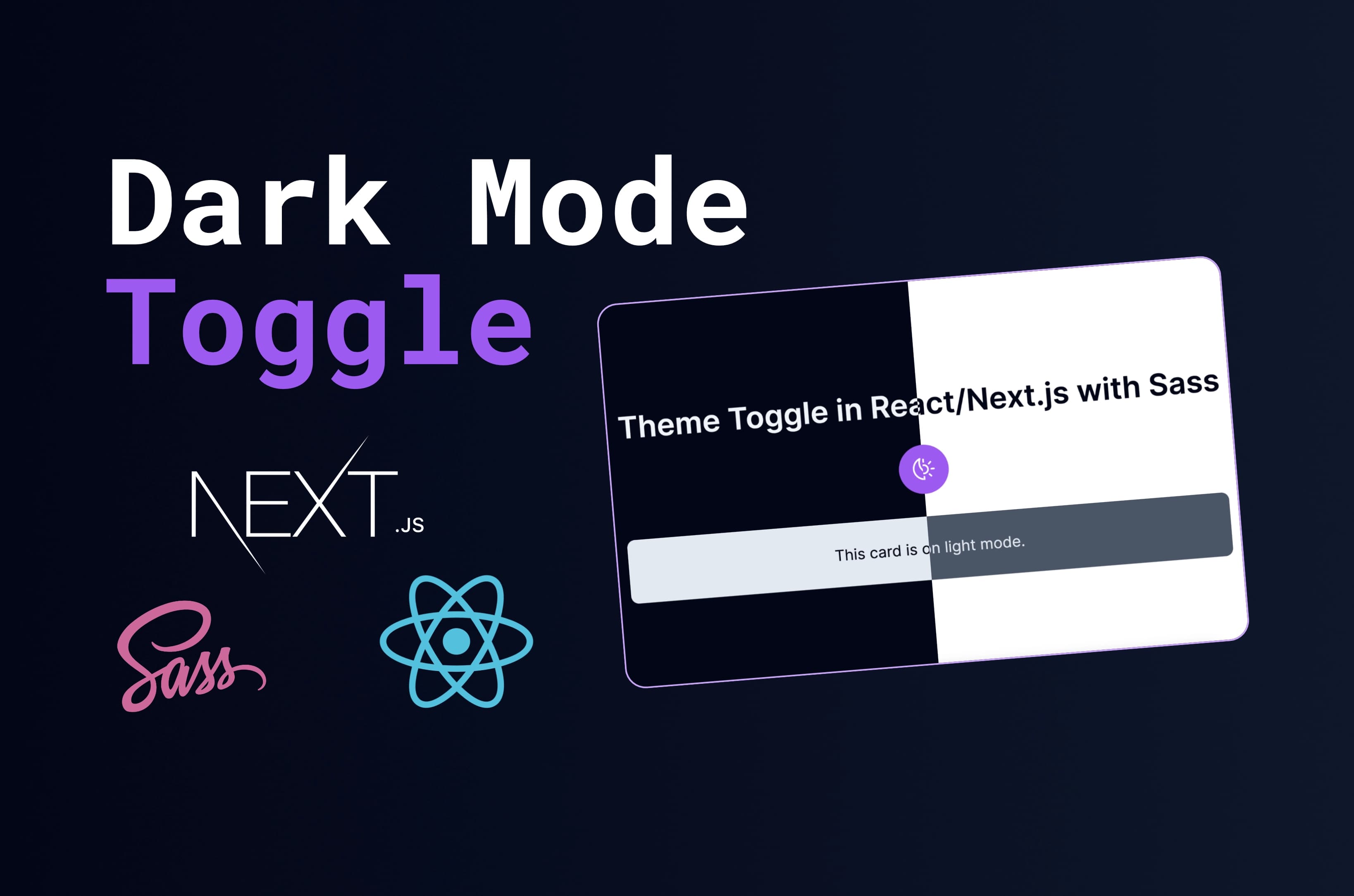
👨🏻💻 Here's What You'll Learn
- Implement a dark mode toggle
- Create a Next.js 13 app with the latest features (app router)
- Implement and use Sass
- Use custom hooks and React Context
- Apply the theme anywhere in your app
📺 Video Tutorial
If you prefer to watch a video tutorial instead, here you go! 👇
If not, you can skip this section and continue reading the article below.
Simple Toggle Button on a Single Page
Let's start with a simple toggle button on a single page. We will use React hooks to manage the state of the theme and Sass to style the button.
Set up Next.js and Sass
Start by setting up Next.js and Sass. We will use the latest version of Next.js with the App Router.
npx create-next-app@latestOn installation, you'll see the following prompts:
What is your project named? theme-toggle
Would you like to use TypeScript with this project? No / Yes
Would you like to use ESLint with this project? No / Yes
Would you like to use Tailwind CSS with this project? No / Yes
Would you like to use `src/` directory with this project? No / Yes
Use App Router (recommended)? No / Yes
Would you like to customize the default import alias? No / Yes
Select an appropriate name and select 'No' for TypeScript, Tailwind CSS, src/ directory, and import alias. Select 'Yes' for App Router, and ESLint.
Next, cd to your project and install Sass.
npm install --save-dev sassWe will also an icon library called Heroicons. Install it as well, but you can use any icon library you want.
npm install @heroicons/reactThen change app/globals.css to app/globals.scss and modify app/layout.js as well.
import './globals.scss';
import { Inter } from 'next/font/google';

const inter = Inter({ subsets: ['latin'] });

export const metadata = {
  title: 'Create Next App',
  description: 'Generated by create next app',
};

export default function RootLayout({ children }) {
  return (
    <html lang="en">
      <body className={inter.className}>{children}</body>
    </html>
  );
}
Create a Simple Button
Now let's create a simple button in app/page.js. We use useEffect to toggle the mode in the body class.
'use client';

import { useState } from 'react';
import { SunIcon, MoonIcon } from '@heroicons/react/24/outline';

export default function Home() {
  const [isDarkMode, setIsDarkMode] = useState(false);

  const toggleTheme = () => {
    setIsDarkMode(!isDarkMode);
    document.documentElement.classList.toggle('dark');
  };

  return (
    <main className="container">
      <div className="content">
        <h1 className="title">Theme Toggle in React/Next.js with Sass</h1>

        <button
          aria-label="Toggle Dark Mode"
          className="toggle-button"
          onClick={toggleTheme}
        >
          {isDarkMode ? (
            <MoonIcon className="icon" />
          ) : (
            <SunIcon className="icon" />
          )}
        </button>
      </div>
    </main>
  );
}'use client';
import { useState } from 'react';
import { SunIcon, MoonIcon } from '@heroicons/react/24/outline';
export default function Home() {
const [isDarkMode, setIsDarkMode] = useState(false);
const toggleTheme = () => {
setIsDarkMode(!isDarkMode);
document.documentElement.classList.toggle('dark');
};
return (
{ /* Step 1 */}
<main className="container">
</main>
{ /* Step 2 */}
<main className="container">
<div className="content">
</div>
</main>
{ /* Step 3 */}
<main className="container">
<div className="content">
<h1 className="title">Theme Toggle in React/Next.js with Sass</h1>
</div>
</main>
{ /* Step 4 */}
<main className="container">
<div className="content">
<h1 className="title">Theme Toggle in React/Next.js with Sass</h1>
<button
aria-label="Toggle Dark Mode"
className="toggle-button"
onClick={toggleTheme}
>
{isDarkMode ? (
<MoonIcon className="icon" />
) : (
<SunIcon className="icon" />
)}
</button>
</div>
</main>
);
}This React component renders a button to toggle between dark and light themes. We use the useState hook and our toggleTheme function to handle the theme state and apply the appropriate CSS class to the document root element.
The button's appearance and text change based on the theme state.
We need to use 'use client' to tell the compiler that we want to use the client-side version of React.
This is because we want to use React hooks. At default, the compiler will use the server-side version of React and hooks are not supported there.
Add Some Styles
Let's add some styles to the button. We first create some variables for the colors and then create .toggle-button class.
$slate-50: #f8fafc;
$slate-100: #f1f5f9;
$slate-200: #e2e8f0;
$slate-300: #cbd5e1;
$slate-400: #94a3b8;
$slate-500: #64748b;
$slate-600: #475569;
$slate-700: #334155;
$slate-800: #1e293b;
$slate-900: #0f172a;
$slate-950: #020617;

$purple-50: #faf5ff;
$purple-100: #f3e8ff;
$purple-200: #e9d5ff;
$purple-300: #d8b4fe;
$purple-400: #c084fc;
$purple-500: #a855f7;
$purple-600: #9333ea;
$purple-700: #7e22ce;
$purple-800: #6b21a8;
$purple-900: #581c87;
$purple-950: #3b0764;

:root {
  background-color: white;
  color: $slate-950;

  &.dark {
    background-color: $slate-950;
    color: $slate-100;
  }
}

.toggle-button {
  border-radius: 999px;
  background-color: $purple-500;
  padding: 0.75rem;
  border: none;
  display: flex;
  align-items: center;
  justify-content: center;
  width: auto;
  margin: auto;
  cursor: pointer;

  &:hover {
    background-color: $purple-400;
  }

  .icon {
    height: 1.75rem;
    width: 1.75rem;
    color: white;
  }
}

// Basic styling for the page

.container {
  display: flex;
  flex-direction: column;
  align-items: center;
  justify-content: center;
  min-height: 100vh;
}

.content {
  margin: auto;
  max-width: 80rem;
  text-align: center;
}

.title {
  margin: 1.5rem 0;
  font-weight: 600;
}
More Scalable Solution With React Context
To ensure that the theme change affects all components the app, we use React Context.
This will allow us to share the theme state across all components and update them accordingly when the theme is toggled.
Create a Context and Provider
First, we need to create a context and a provider. We create one in the root folder context/ThemeContext.js.
'use client';

import { createContext, useContext, useState } from 'react';

export const ThemeContext = createContext();

export const ThemeProvider = ({ children }) => {
  const [isDarkMode, setIsDarkMode] = useState(false);

  const toggleTheme = () => {
    setIsDarkMode(!isDarkMode);
    document.documentElement.classList.toggle('dark');
  };

  return (
    <ThemeContext.Provider value={{ isDarkMode, toggleTheme }}>
      {children}
    </ThemeContext.Provider>
  );
};

export const useTheme = () => useContext(ThemeContext);
Wrap the App With the Provider
Then we wrap the ThemeProvider around the RootLayout in app/layout.js.
import './globals.scss';
import { Inter } from 'next/font/google';
import { ThemeProvider } from '@/context/ThemeContext';

const inter = Inter({ subsets: ['latin'] });

export const metadata = {
  title: 'Create Next App',
  description: 'Generated by create next app',
};

export default function RootLayout({ children }) {
  return (
    <html lang="en">
      <body className={inter.className}>
        <ThemeProvider>{children}</ThemeProvider>
      </body>
    </html>
  );
}
Use the Context for the Toggle Button
Now we can use the useTheme hook to access the theme state and toggle function. Let's do this for the toggle button in app/page.js.
'use client';

import { useTheme } from '@/context/ThemeContext';
import { SunIcon, MoonIcon } from '@heroicons/react/24/outline';

export default function Home() {
  const { isDarkMode, toggleTheme } = useTheme();

  return (
    <main className="container">
      <div className="content">
        <h1 className="title">Theme Toggle in React/Next.js with Sass</h1>

        <button
          aria-label="Toggle Dark Mode"
          className={`toggle-button ${isDarkMode ? 'dark' : 'light'}`}
          onClick={toggleTheme}
        >
          {isDarkMode ? (
            <MoonIcon className="icon" />
          ) : (
            <SunIcon className="icon" />
          )}
        </button>
      </div>
    </main>
  );
}
Create a Card Component
Now, every other component can access the theme state and react accordingly when the theme is toggled. Let's try this with a simple card component.
Let's first create a 'components' folder and create a Card.js component.
import { useTheme } from '@/context/ThemeContext';

const Card = () => {
  const { isDarkMode } = useTheme();

  return (
    <div className={`card ${isDarkMode ? 'dark' : 'light'}`}>
      This card is on {isDarkMode ? 'dark mode' : 'light mode'}.
    </div>
  );
};

export default Card;
Move the Toggle Button to Its Own Component
Let's also move the toggle button to its own component in components/ThemeToggleBtn.js.
import { SunIcon, MoonIcon } from '@heroicons/react/24/outline';
import { useTheme } from '@/context/ThemeContext';

const ThemeToggleBtn = () => {
  const { isDarkMode, toggleTheme } = useTheme();

  return (
    <button
      aria-label="Toggle Dark Mode"
      className="toggle-button"
      onClick={toggleTheme}
    >
      {isDarkMode ? (
        <MoonIcon className="icon" />
      ) : (
        <SunIcon className="icon" />
      )}
    </button>
  );
};

export default ThemeToggleBtn;
Move the Card and Toggle Button to the Page
Then we import the Card and ThemeToggleBtn component in app/page.js.
'use client';

import Card from '@/components/Card';
import ThemeToggleBtn from '@/components/ThemeToggleBtn';

export default function Home() {
  return (
    <main className="container">
      <div className="content">
        <h1 className="title">Theme Toggle in React/Next.js with Sass</h1>

        <ThemeToggleBtn />

        <Card />
      </div>
    </main>
  );
}
Add Styling for the Card Component
Lastly, we need to add some styling for the card component in globals.scss.
.card {
  overflow: hidden;
  border-radius: 0.5rem;
  padding: 1.5rem;
  margin: 1.5rem 0;

  &.light {
    background-color: $slate-600;
    color: $slate-200;
  }

  &.dark {
    background-color: $slate-200;
    color: $slate-950;
  }
}

// Rest of the code
Now, when we toggle the theme, the card component will also change its theme accordingly.
This is because the card component is using the useTheme hook to access the theme state and react accordingly when the theme is toggled.
Conclusion
And that's how we can create a simple toggle button in React/Next.js with Sass. We also learned how to make the theme change affect all components in the app using React Context.