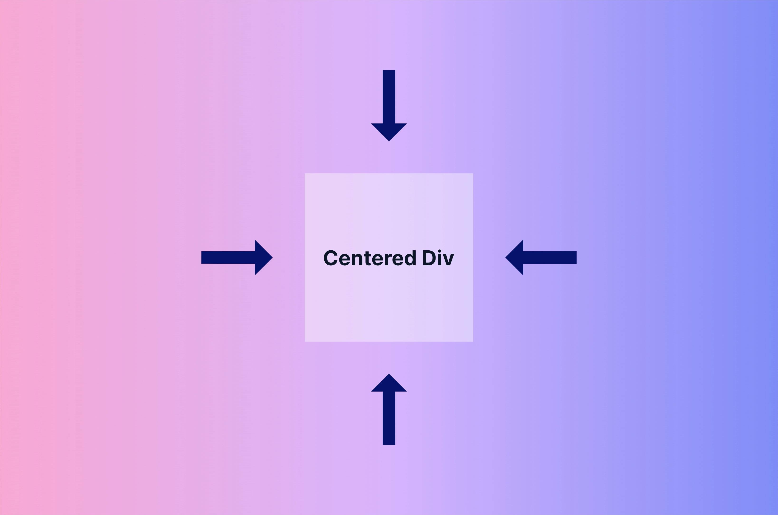
It seems that centering a div horizontally and vertically is as old of a problem as the web itself.
There are many ways to do it, and with Tailwind CSS, it's very easy.
With Tailwind CSS, you'll never have to touch your CSS files unless you want to.
With a few helper classes, you can easily center your divs horizontally and vertically, and here are three ways to do it.
We'll go through each method and explain what each class does. If you just want to see the code, feel free to skip to the code section.
Method #1: Flexbox
The first technique we will explore is the use of flexbox.
Flexbox is a powerful CSS layout module that provides a flexible way to allocate space between elements in a container.
Just Tailwind CSS
Here's how to center a div using flexbox with Tailwind CSS:
<div class="flex min-h-screen justify-center items-center">I'm centered</div>flexsets the display property to flex. This allows us to use flexbox.min-h-screensets the min-height property to 100vh. This ensures that the div takes up the full height of the screen. Without it, we would not be able to see the effect of centering the div vertically.justify-centeranditems-centeractually center the div horizontally and vertically.
Tailwind CSS Classes to Vanilla CSS
To get a better understanding, here's what the vanilla CSS of the Tailwind CSS classes would look like.
.flex {
  display: flex;
}

.min-h-screen {
  min-height: 100vh;
}

.justify-center {
  justify-content: center;
}

.items-center {
  align-items: center;
}
Vanilla HTML and CSS
And here's how you'd do this completely with vanilla HTML and CSS.
<div class="container">
  <div>I'm centered</div>
</div>.container {
display: flex;
min-height: 100vh;
justify-content: center;
align-items: center;
}Method #2: Grid Layout
The second technique we will explore is the use of Grid.
Grid is another powerful CSS layout module that allows you to create complex grid-based layouts with ease.
With Tailwind CSS, centering a div using grid is easy.
Just Tailwind CSS
<div class="grid place-items-center min-h-screen">I'm centered</div>gridsets the display property to grid.place-items-centersets the align-items and justify-items properties to center. This allows us to center the div both horizontally and vertically.min-h-screensets the min-height property to 100vh. Similar to the flexbox example, this ensures that the div takes up the full height of the screen.
Tailwind CSS Classes to Vanilla CSS
To get a better understanding, here's what the vanilla CSS of the Tailwind CSS classes would look like.
.grid {
  display: grid;
}

.place-items-center {
  place-items: center;
}

.min-h-screen {
  min-height: 100vh;
}
Vanilla HTML and CSS
And here's how you'd do this completely with vanilla HTML and CSS.
<div class="container">I'm centered</div>.container {
display: grid;
place-items: center;
min-height: 100vh;
}Method #3: Absolute Positioning
The last technique uses absolute positioning. We position elements relative to their parent container or the document itself.
This method is not my go-to method, but it's still worth mentioning.
Just Tailwind CSS
<div class="min-h-screen">
  <div class="absolute top-1/2 left-1/2 -translate-x-1/2 -translate-y-1/2">
    I'm centered
  </div>
</div>absolutesets the position property to absolute. This positioning makes the div independent of the document flow, so it can be placed precisely.min-h-screensets the min-height property to 100vh. This ensures that the div takes up the full height of the screen.top-1/2andleft-1/2- These classes position the div at the center of its parent container.-translate-x-1/2and-translate-y-1/2shift the div back by half of its width and height, respectively, ensuring perfect centering.
Tailwind CSS Classes to Vanilla CSS
To get a better understanding, here's what the vanilla CSS of the Tailwind CSS classes would look like.
.min-h-screen {
  min-height: 100vh;
}

.absolute {
  position: absolute;
}

.top-1/2 {
  top: 50%;
}

.left-1/2 {
  left: 50%;
}

.-translate-x-1/2 {
  transform: translateX(-50%);
}

.-translate-y-1/2 {
  transform: translateY(-50%);
}
Vanilla HTML and CSS
And here's how you'd do this completely with vanilla HTML and CSS.
<div class="wrapper">
  <div class="container">I'm centered</div>
</div>.wrapper {
min-height: 100vh;
}
.container {
position: absolute;
top: 50%;
left: 50%;
transform: translate(-50%, -50%);
}Conclusion
That's three different ways to center divs with Tailwind CSS. Whether you choose to use flexbox, grid, or absolute positioning, Tailwind CSS provides powerful utility classes that make centering divs a breeze.
However, it never hurts to understand the underlying CSS, as knowing CSS makes using Tailwind CSS much easier. Learn CSS and you will know how to use Tailwind CSS much better.